Survey’s play the main part when receiving client feedback on a particular product or service one offers for the public.

Are we getting too many negative feedbacks? Why? How can we fix issues? What are we doing well and what have we improved after some time? What are the most key issues to comprehend?
Assessing responses from customer surveys and creating a report that will give us the answers to these questions is easier said than done. It may take us hours, or even days to go through all responses and find the root of a problem.
That’s when Sentiment Analysis comes up and it can help us make sense of survey responses to automatically answer questions such as:
- How many negative responses did we receive?
- What aspects of our product/service do customers love?
- What aspects of our product/service do customers hate?
- Has a particular product feature improved?
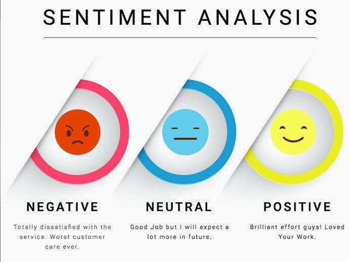
Let’s see how we can use a simple Sentiment Analysis for Survey Data and get answers for the above questions I’ve mentioned.
Using a python, Our analysis was completed on the qualitative feedback provided by clients, I have a CSV file of responses to the question “What did we do well” to a service I provide at my business.
Sentiment Analysis consists of two parts; Subjectivity and Polarity. Simply, Polarity and Subjectivity can be explained as follows:
- Polarity — It simply means emotions expressed in a sentence, across a range of negative, to positive.
- Subjectivity — Subjective sentence expresses some personal feelings, views, or beliefs.
So here’s a summary of what I’m going to do in the next 10–15 Minutes.
- I’m going to create a new CSV file by reading my existing client response file then generating Subjectivity and Polarity for each client feedback.
- Then I’ll plot some graphs to get an idea of how my clients are feeling. For this section, I’ll be creating
- A Box Plot
- Scatter Plot
- Covariance and Correlation using Scatter Graph
- Polarity Distribution
- Polarity Density Distribution
3. After that, I’m eager to find out the Frequent Words they used while giving feedback.
4. Then put them into a word cloud
Alright ladies and gentlemen, Let’s go!

Jump into a new Jupyter notebook project and, first things first.
import pandas as pd            //Pandas
from textblob import TextBlob //For Sentiment Anlysis
from itertools import islice //Will Explain Later
Read CSV File (Q7_Text.CSV) in to a DataFrame object.
df_survey_data = pd.read_csv("Q7_Text.csv")As I said before, I’m generating a new CSV file so I’ll create a list object and store my column names for my new file.
COLS = ['date','text', 'sentiment','subjectivity','polarity']Then I’m using these columns for a brand new dataframe called df.
df = pd.DataFrame(columns=COLS)Now comes a tricky part, I want to read each line of my Q7_Text.Csv and calculate sentiment then store the result in a new CSV file.
I want to change the starting index of iterrows() method that’s why I’ve imported itertools.islice at the beginning of my code. Here’s where I grabbed this trick.
That piece of code has created me a nice little file with all the sentiments.
Let’s see what I have with a df.head()

Let’s run a df.describe() for a summary.
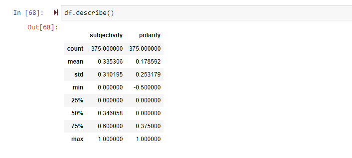
So my program has confirmed to me that all the 375 records are there and gave me a mean polarity of 0.178, which is good that means as an average, most people are in between neutral to positive with our services.
And as you can see the 50% Value which means the median is zero (0). Out of 375 records, I’m getting the median value as zero can be coincidence or maybe I have too many neutral feedbacks which will affect the accuracy of our analysis. I need to clear my head with that doubt so I’m going to Find rows with non zero values in a subset of columns in pandas dataframe.
To accomplish that I’m using an alternative solution which uses select_dtypes() method:
dffilter = df.loc[(df.loc[:, df.dtypes != object] != 0).any(1)]Take a sneak peek at what dffilter is made of.
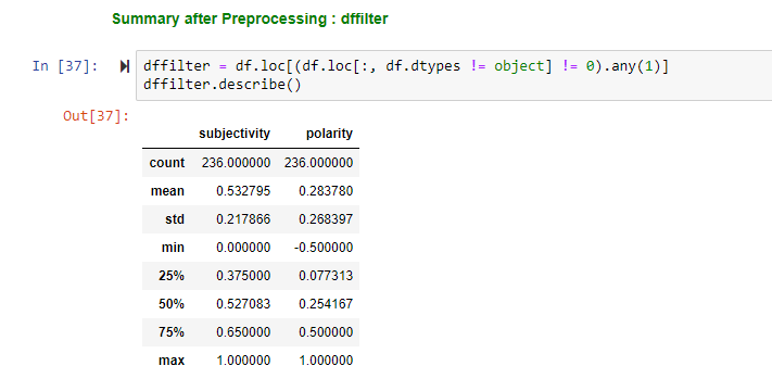
HA! Now I can clearly see that my doubt is a reality! New count is equal to 236. So the delta value of df and dffilter is 139. delta = count(df) — count(dffilter),
Which means I’ve got 139 neutral feedbacks mate, no wonder I got ‘0’ as my median value. Not just that, Mean polarity has risen up to 0.28 and the median is no more 0. (Which clearly explains that those 139 Neutrals were directly affected to my analysis)
Let me take you back to my College days.

My friend Farzad has asked this question “How can I transfer a data including lots of zero (precipitation) to a normal distribution?”
Mr. Stephen Politzer-Ahles has answered that “I don’t think you can…”
So as Mr. Stephen said and I agree that the best option would be to separate the analyses.
As a result, Out of 375 client feedbacks, our analysis has detected 139 Neutral polarities (polarity is 0) so those records were cut out for more accurate results. Hence, these results are based on the remaining 236 feedbacks for the question “what did we do well”.
PLOTS
1. BOX PLOT
Let’s create a box plot as the first step of our plot analysis. (Remember, We are using dffilter dataframe from now onwards)
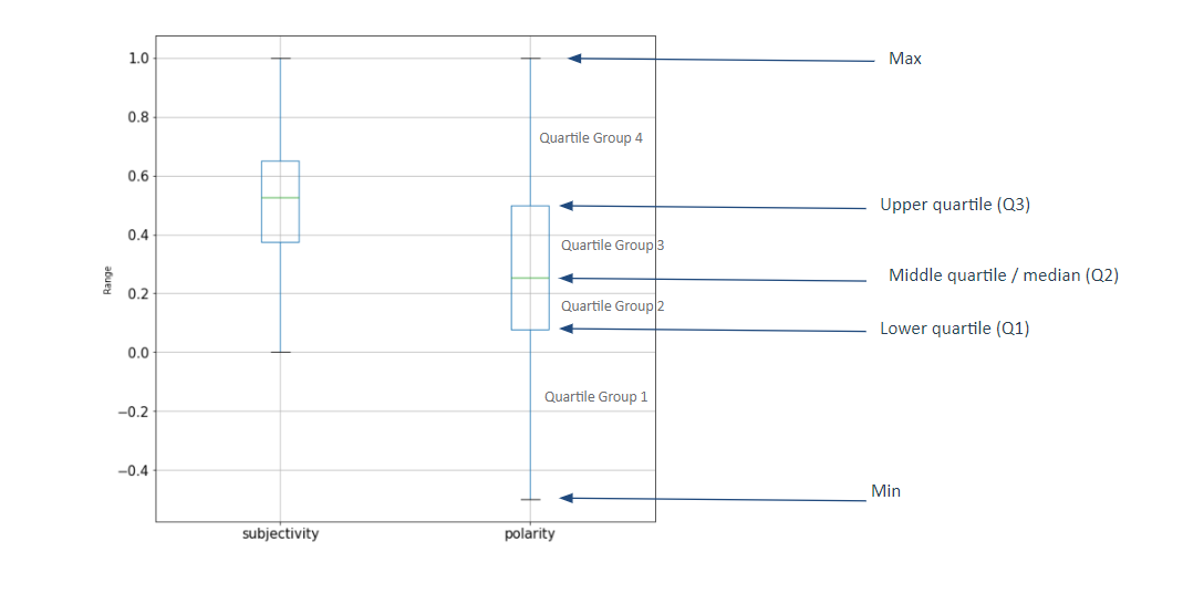 Basically, The Boxplot is a graphical representation of the describe() method. I’ll make a little table here with the values I’ve got for dffilter.describe() and you’ll make a comparison against the two. Except for count, mean and standard deviation all the outliers are graphically represented by the boxPlot.
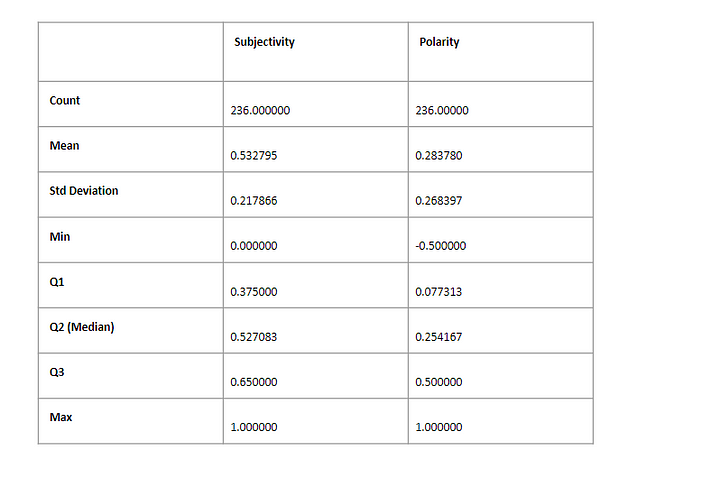 result of describe() for dffilter2.
The scatter diagram is used to find the covariance and correlation between two variables. This diagram helps you determine how closely the two variables are related. After determining the correlation between the variables, you can then predict the behavior of the dependent variable based on the measure of the independent variable.

I’ll briefly explain what Covariance and Correlation means:
Covariance
Covariance indicates how two variables are related (In our case, It’s Subjectivity and Polarity). A positive covariance means the variables are positively related and they move in the same direction, while a negative covariance means the variables are inversely related and they move in opposite directions.
Correlation
Correlation is another way to determine how two variables are related. In addition to telling you whether variables are positively or inversely related, correlation also tells you the degree to which the variables tend to move together.
Let’s calculate Covariance and Correlation with Python!
#Result of Covariance[[0.04746545 0.06750151]
[0.06750151 0.15957442]]- The covariance between the two variables is 0.06750151. We can see that it is positive, suggesting the variables change in the same direction as we expect.
Pearsons correlation: 0.77561- We can see that the two variables are positively correlated and that the correlation is 0.775. This suggests a high level of correlation, e.g. a value above 0.5 and close to 1.0.
So, By looking at our Scatter Diagram, What can we say about these two variables?
- The plot shows a positive correlation between Subjectivity and Polarity.
Meaning, as subjectivity increase, the polarity in the response increase too, Or in other words, the more strong feelings are expressed, the more the overall comment is subjective.
3. POLARITY DISTRIBUTION & DENSITY CURVE
The polarity distribution describes all the values of the variable Polarity within a given range. This range will be bounded between the minimum and maximum possible values (-1 to +1 in our case). By looking at the distribution we can identify how the polarity is distributed among clients and key factors as mean, median and standard deviation.
Most commonly distribution is Normal Distribution or “Bell Curve”.The important thing to note about a normal distribution is the curve is concentrated in the center and decreases on either side.
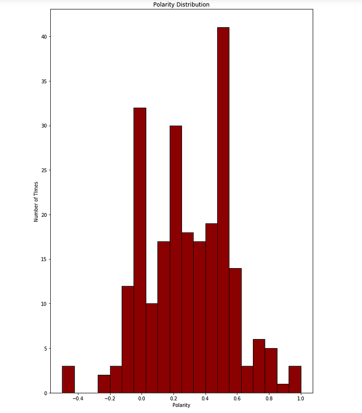
Here’s how to enable the density curve on it.
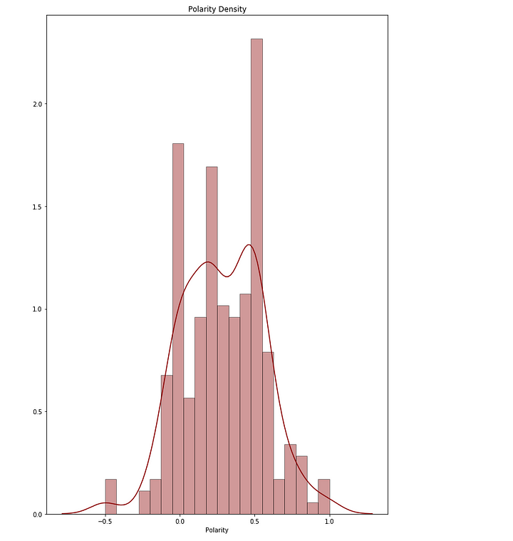 Polarity Density Curve
4. FREQUENT WORDS
Frequently we want to know which words are the most common from survey s since we are looking for some patterns. Given the data set, we can find k number of most frequent words with Natural Language Processing (NLP) using Python.
In natural language processing, useless words (data), are referred to as Stop Words: A stop word is a commonly used word (such as “the”, “a”, “an”, “in”) that a search engine has been programmed to ignore, both when indexing entries for searching and when retrieving them as the result of a search query. So, We’ve generated 10 most commonly used words in our survey.
If you are new to Python NLTK, Click here to read more about it.
Let’s download the nltk package.
import nltk
nltk.download()
store all the stop words in ‘English’ into a list called stopwords.
stopwords = nltk.corpus.stopwords.words('english')With the help of regular expression, I’m adding more symbols that might appear as frequent because I want them to be ignored.
RE_stopwords = r'\b(?:{})\b'.format('|'.join(stopwords))words = (df.text
.str.lower()
.replace([r'\|',r'\&',r'\-',r'\.',r'\,',r'\'', RE_stopwords], [' ', '','','','','',''], regex=True)
.str.cat(sep=' ')
.split()
)Ok Cool, It’s almost over man, Thanks for hanging out this further :) Let’s kick off this final stage:
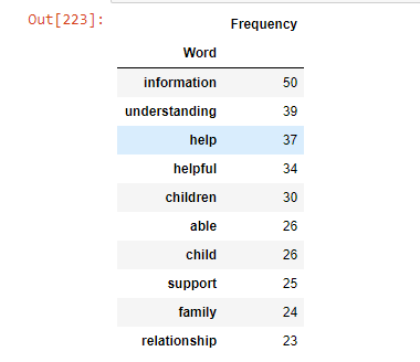
Let’s plot them in a bar chart and a pie chart.
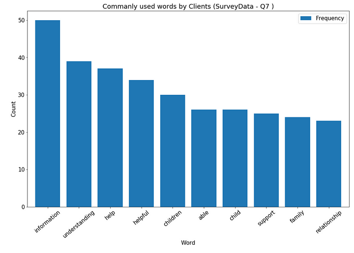 Bar graph of Frequent Words
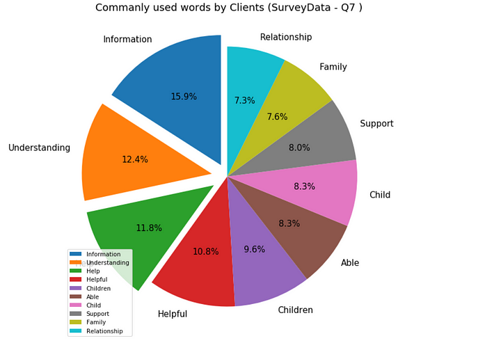 Pie Chart of Frequent Words
5. WORDCLOUD
Many times you might have seen a cloud filled with lots of words in different sizes, which represent the frequency or the importance of each word. This is called Tag Cloud or WordCloud.
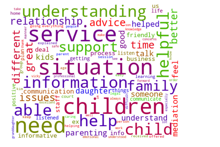 WordCloud generated using Frequent Words
After considering the
- Box plot values
- Relation of scatter diagram
- Covariance and Correlation values
- Polarity distribution and density shape of our data
- Frequently used words and WordCloud
We could say that
- overall polarity demonstrates a positive value.
- Overall subjectivity is a positive value.
- Subjectivity and Polarity are moving towards the same direction as one increases, the other is likely to increase as well.
- Or in other words, the more strong feelings are expressed, the more the overall comment is subjective and vice versa.
To conclude the article, Our analysis was completed on the qualitative feedback provided by clients. Responses to the question “what did we do well” demonstrated a positive polarity (mean 0.283780 and standard deviation 0.268397 where polarity can range from negative -1.0 to positive 1.0 ) with a strong level of subjectivity in responses (mean 0.532795 and standard deviation 0.217866 where 0.0 is very objective and 1.0 is very subjective). This information proves us that “most responses to this question were of a positive, subjective nature.”
Keen on getting to know me and my work? Click here for more!
Thanks a lot.
Here's another sentiment analysis project using Twitter Live data.
Because that's a must, nowadays people don't tweet without emojis, as in a matter of fact it became another language…www.jayasekara.blog


2 Comments
This comment has been removed by the author.
ReplyDeleteThanks for sharing this insighful information on survey data analysis.I'll definitely be back for more! Keep sharing..
ReplyDelete