

Being a data scientist has a lot of perks and my favorite of them is the ability to Visualize the Data as we like.
Although, sometimes you may run into some complications and could possibly waste a significant amount of time on Google to figure out the best way to plot that Geographical Data you have. In this article, I’m going to save your time by providing a real-time solution with the use of Folium Python Library.

The reason behind me starting this article is that I remember me wasting a full workday to figure out a way to plot certain postal codes in an Australian Map. I tried to do this with Google Data Studio but this only supports for US Postal Codes. That makes me wonder, “What, other countries are not important? Is that it?” which leads me to fix this using Latitude and Longitude to plot data in Google Data Studio. Yes, I tried that but I’m not impressed. Sigh!
This is the maximum zoom size when I set the Zoom Area to Country>Australia. It’s something but I can’t put this in my report, can I?
Then I spoke to Ned Letcher who I get to know after his speech at Melbourne Python Charmer’s Meetup and he’s shown me the path and asked me to go with Folium. Thank you, Ned! :)
So, I’ve put Data Studio aside and took his advice and started a brand new project in Python.
Now I’ll take you to my scenario:
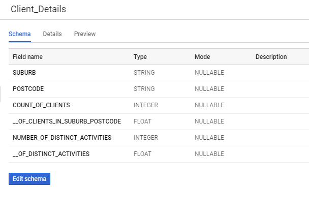
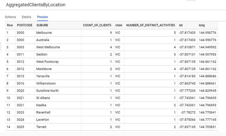
Let’s say I have clients based on Victoria, Melbourne and I needed to plot where my clients are located in the past financial year. I’ve got the CSV file which has these 5 Columns: Postal Code, Suburb, State, NumberOfClients, % of clients in the suburb; which I extracted from my Data Warehouse using Google Big Query. I will name this as Table o1.
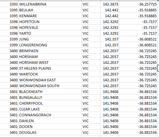
Now I wanted to map these postal codes with latitude and longitude and I needed an Accurate (Because most of the free datasets are nowhere near accurate) data set which includes all major suburbs in Melbourne. Then again comes my friend Ned and redirected me to this page which has Australian Post Codes + Latitude/Longitude with more than 16K entries. Now I am Impressed!
Then, I needed to combine these two CSV files and make one (Similar to SQL Join) which includes these data fields:
- PostCode
- Suburb
- Number of Clients
- State
- Latitude
- Longitude
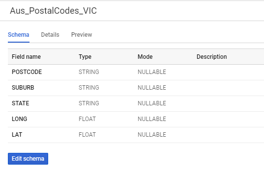
I’m sure there are myriad of ways to join these two files but since I’m more of a GCP buddy, I’ll be using BigQuery to join these two files (Data Tables). I’ll be creating a new data table as Aus_PostalCodes_VIC by using the above dataset.
Run a simple BigQuery Join and save the result in another table as AggregatedClientsByLocation.
Cool. Now I have the data set as I dreamed of. Now comes the second part with Folium. If you don’t have folium installed on your computer run the pip command and it’ll finish by a min or two.
Create a new Notebook in Jupyter and let’s do some CODING!

First things first:
import folium
import pandas as pd
df = pd.read_csv("AggregatedClientDetails2018_19.csv")
df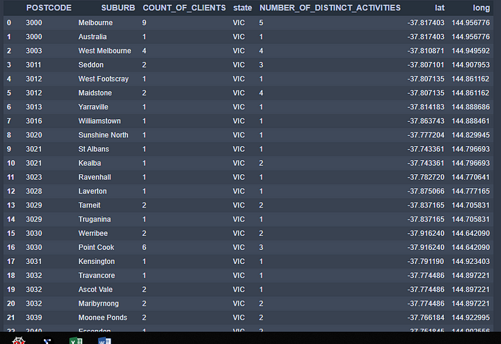
Since I’ll be mainly focusing on Melbourne and surrounded suburbs, I’ll be using coordinates for Melbourne CBD (City) and will set the zoom size to 8.
m = folium.Map([-38.043995, 145.264296], zoom_start=8)
m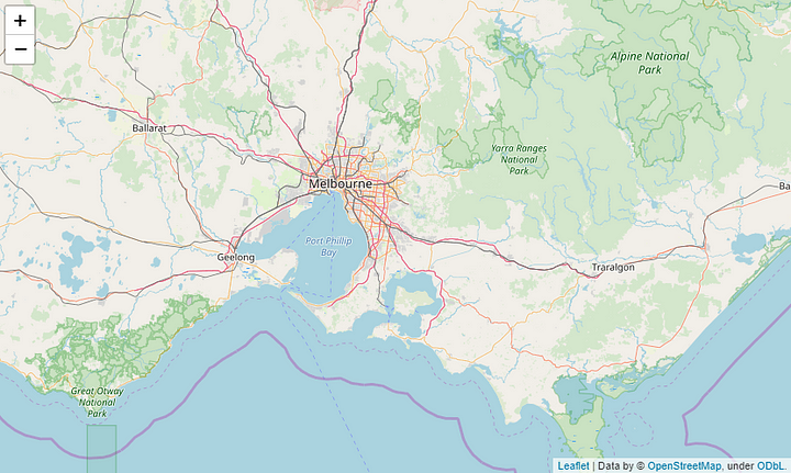
I want to create a folium marker to plot all the locations in my data table. If you’re new to Folium, click here for the QuickStart.
Alright, now I have these requirements to be full filled.
- So I want to read each row and get the column lat and long to plot the location on our sweet map.
- I want to display the number of client value when I click on each location (PopUp).
- Name of the location should be displayed when hovering over (ToolTip).
for index, row in df.iterrows(): folium.Marker([row['lat'], row['long']],
popup=row['COUNT_OF_CLIENTS'],
tooltip=row['SUBURB'],
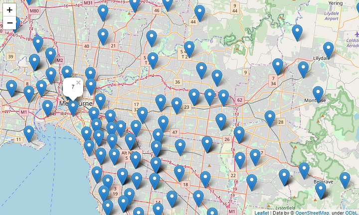
).add_to(m)Let’s see what we got:
m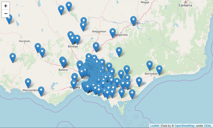
Now Let’s check whether the tooltip and popup work correctly.
Now you can save it using the following command:
m.save('Client_Address_20118_19.html')Cool right? Are we done yet? Afraid not.

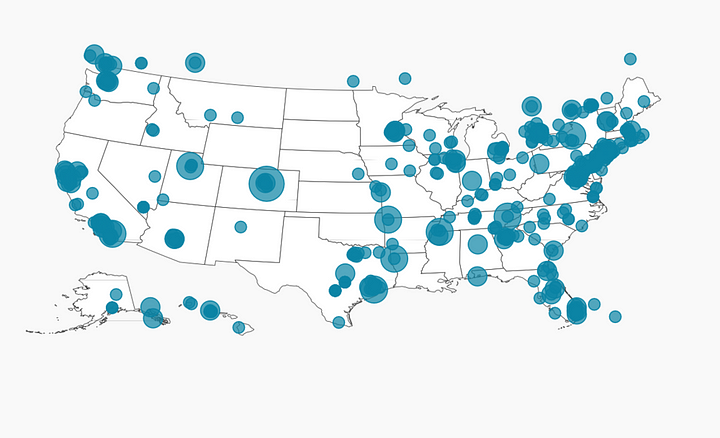
I’ve got the map I wanted. But is it the map I Dreamed of? No. I want something more than this. Something like this; Just because we live out of US doesn’t mean we can’t plot this!
I want the bubble size to be determined by the number of clients I have in that Suburb.
Not just that, I’m gonna categorize my Number Of Clients into 5 Sections:
- Number Of Clients > 150
- Number Of Clients > 100
- Number Of Clients > 50
- Number Of Clients > 10
- Number Of Clients < 10
Let’s see how this is achieved. Inside the for loop declare some if conditions and assign colors accordingly.
if row['COUNT_OF_CLIENTS'] >= 150:
        marker_color = 'darkred'
        fill_color = 'darkred'
    elif row['COUNT_OF_CLIENTS'] >= 100:
        marker_color = 'darkred'
        fill_color = 'red'
    elif row['COUNT_OF_CLIENTS'] >= 50:
        marker_color = 'darkred'
        fill_color = 'lightred'
    elif row['COUNT_OF_CLIENTS'] >= 10:
        marker_color = 'darkred'
        fill_color = 'orange'
    else:
        marker_color='darkred'
        fill_color = 'darkpurple'
Then instead of using Folium.Marker, I’m using Folium.Circle
folium.Circle(
          location=[row['lat'], row['long']],
          popup= 'Clients:' +str(row['COUNT_OF_CLIENTS']),
          tooltip=row['SUBURB'],
          radius=row['COUNT_OF_CLIENTS']*10,
          color=marker_color,
          fill=True,
          fill_color=fill_color,
       ).add_to(m)
So the complete for loop should look like this:
for index, row in df.iterrows():if row['COUNT_OF_CLIENTS'] >= 150:
marker_color = 'darkred'
fill_color = 'darkred'
elif row['COUNT_OF_CLIENTS'] >= 100:
marker_color = 'darkred'
fill_color = 'red'
elif row['COUNT_OF_CLIENTS'] >= 50:
marker_color = 'darkred'
fill_color = 'lightred'
elif row['COUNT_OF_CLIENTS'] >= 10:
marker_color = 'darkred'
fill_color = 'orange'
else:
marker_color='darkred'
fill_color = 'darkpurple'
folium.Circle(
location=[row['lat'], row['long']],
popup= 'Clients:' +str(row['COUNT_OF_CLIENTS']),
tooltip=row['SUBURB'],
radius=row['COUNT_OF_CLIENTS']*10,
color=marker_color,
fill=True,
fill_color=fill_color,
).add_to(m)Let’s head to the result now, shall we? :)
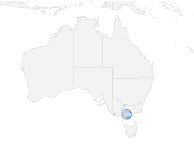
m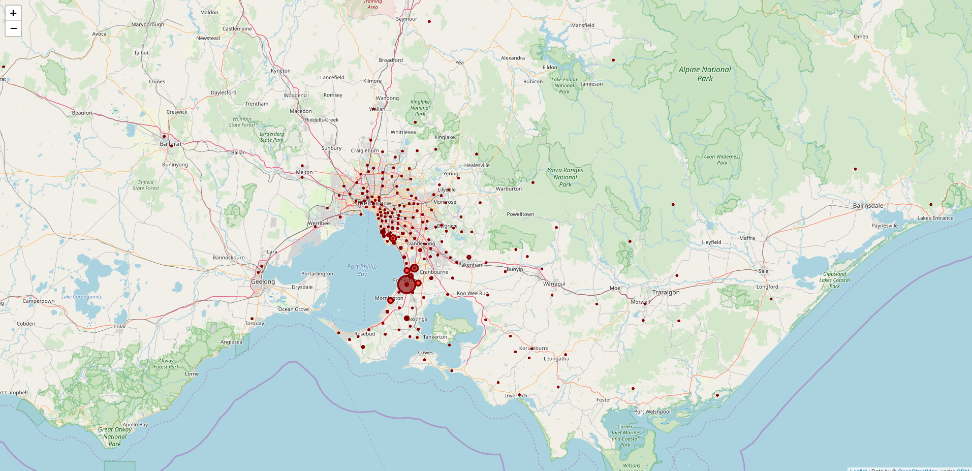
Let’s zoom it in.
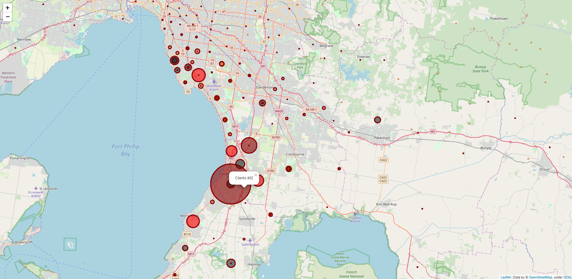
So, This is how I wanted my map to be and I’m going to include this in my report. Click here to see the full map (Download and View). I hope this article finds you well. Let me know if you have any questions or issues regarding the code. Thank You.
See you in another life!
Adios!


0 Comments